
There are some significant changes coming to how we browse the web on iOS 15 and macOS Monterey. If you follow Apple news or other tech writers, I am sure you have seen just how polarizing the new Safari is.
Chaim Gartenberg writing for The Verge:
Over a decade of muscle memory has trained my brain to reach up for the menu bar on smartphones. I get Apple’s motivation in moving it to the bottom, making it easier to reach on the increasingly large phones it makes and putting the actual content of devices front and center at the top of the screen, it’s still a change that’ll require an adjustment period.
JuanSC Writing for Mac O’Clock:
Modifying habits that have been built for ten years is not going to be easy. We have always clicked on the top address bar to move through Safari and reload a page. And the bottom one to share, go back and forth, open tabs and history.
But it is easy to see how reloading the web and sharing are the ones that can bring us the most problems. Because it is not obvious where we are going to find them, despite the fact that when you click on the menu they have a preferred place. And when the user knows where they are, they will see that options that were previously accessible with one tap now require two steps.
Stephen Hackett writing for Six Colors:
Safari 15 brings big changes, and surely not everyone will be a fan. I, for one, think the expanded use of color is distracting, and the tabs-aren’t-just-tabs-anymore design confusing at times. I hope Apple might reconsider some of these more drastic design changes during the beta process this summer.
Clearly, there is much left to be desired from Apple when it comes to the changes to one of the most popular apps on the planet.
The Problems
Let’s dive right into what the issue is for Safari. I want to cover the three biggest issues I encounter. There are other minor things that bother me about Safari, but that is for another time. Today, I want to bring up the more drastic changes that fundamentally change how we browse the web.
The tab bar doesn’t help
Apple has moved the tab bar (or address bar as many call it) from the top of the screen to the bottom. This is obviously meant to make it more usable for bigger phones. As an iPhone 12 Pro Max user, this is a welcome change, but the problem is how this new bar behaves.
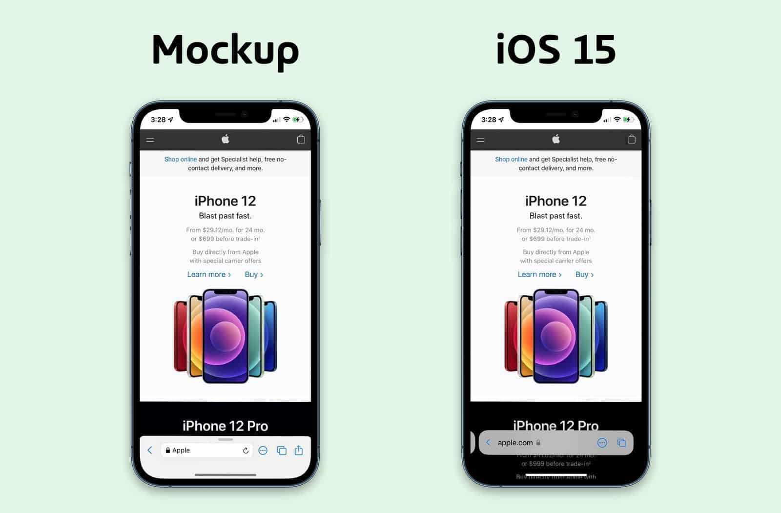
The new tab bar is no longer connected to the bottom of the screen, it now floats.
As you can see, the bottom bar now floats and shows some content between the bottom of the bar and the bottom of the screen. Or, as Apple puts it, “Safari gets a new design that makes controls easier to reach with one hand and puts content front and center.”
The problem here is that the tab bar isn’t working well for some websites. A large amount of the websites that aren’t working properly are because of a floating menu or buttons. Nintendo’s website, for instance, is horrible to use in the new Safari.

It is almost impossible to use the bottom buttons on the website when the floating bar is active, making it incredibly frustrating as a user.
What makes this even more of a conundrum is that there are other sites that work perfectly fine with the new Safari. Twitter, for instance, works just fine.
My website, however, has a subscribe button that wasn’t working right with the new Safari.
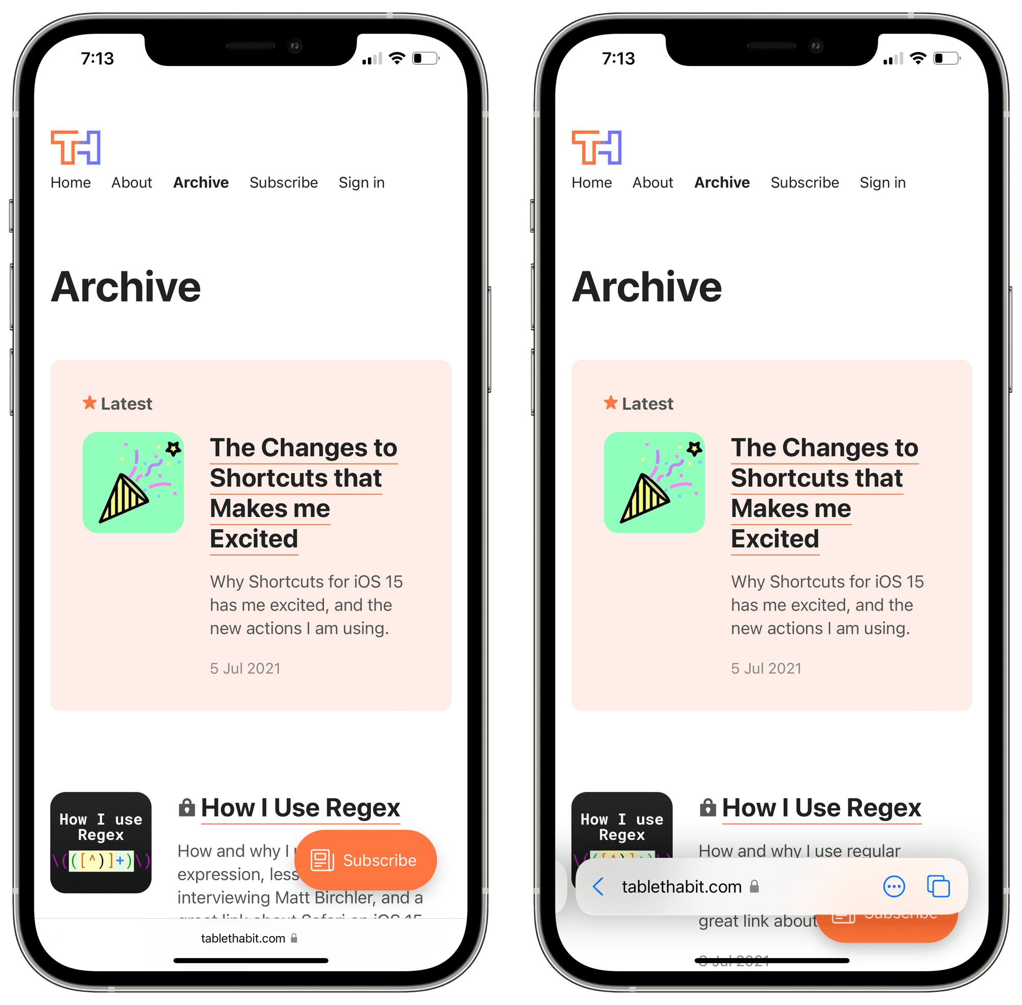
On the left, you see my website with a Subscribe button floating fine when the tab bar is minimized. However, when it is active, you see that the Subscribe bar isn’t floating above it as it should.
I am sure there is a way to make this work, but I am not a web developer and the number of people that actually click on that button is most likely slim to none. Because of this, I decided to just eliminate it from my website entirely.
Where’s the Share button again?
The new design also entirely ruins all muscle memory we have with Safari. We no longer can go by memory on where the Share button, reload button, or back buttons are. We are back to square one with web browsing on our phones.
To add insult to injury, the functionality of Safari is now hidden away in a junk-drawer styled “…” button. If you want to do anything useful with Safari, you now have to activate the bottom bar, tap the “…” button and select what you want.
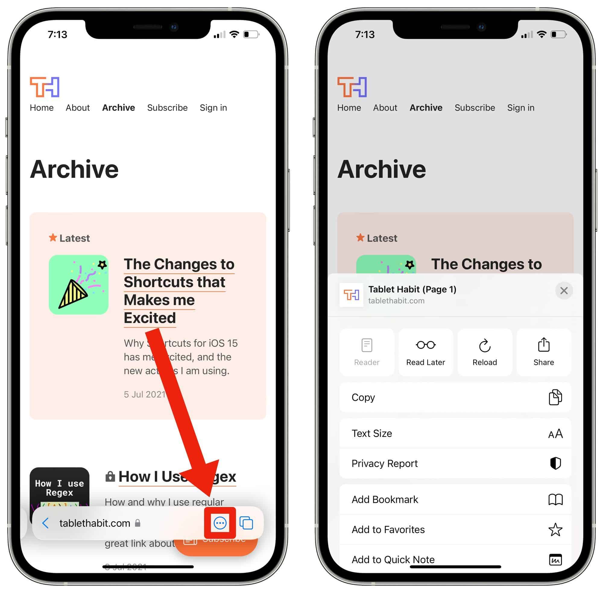
If you want to share this via the standard Share Sheet, you have to tap on another button to get access to that. Feel fatigued yet? I say that in jest, but it is obvious that Apple has a problem with quick access in Safari.
Sure, my website gets an added line or two of content, but the cost of bringing things “front and center” isn’t worth the added sentence I can read on an infinitely scrolling feed.
Tabs on the iPad and Mac are worthless
I’ve spoken enough about the woes on the iPhone, but the iPad and Mac aren’t any better. The biggest, most griped about thing with the new Safari is the tabs. No matter what you do, the tabs in Monterey and iPadOS 15 are no longer reliable.
By reliable, I mean that because of the nature of how tabs work, I have to play Where’s Waldo with the tabs on my screen. Gone are the days when tabs were normally in the same vicinity because now instead of the tabs being separate from the address bar, Apple has decided to bring it all into one amorphous blob.
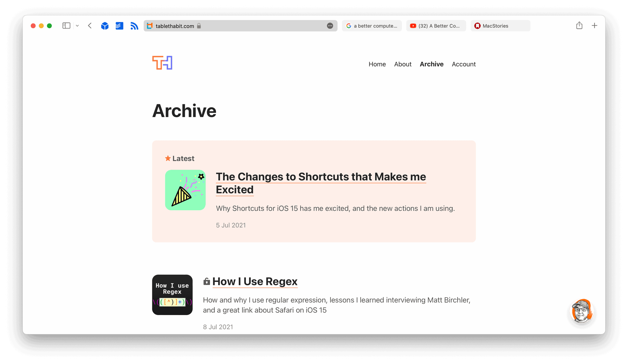
While this may look fine in a screenshot, when you are using it in practice it is almost impossible to find the tab you want once you have more than 5 or 6 tabs open at a time.
What is the most difficult for me, is that I can no longer reliable guess what keyboard shortcut I need to press to get to a specific tab. If you don’t know if you wanted to open the third tab in Safari, you can just press Command-3 and you are there. Back when Safari had a uniform tab length and the address bar was separate from tabs, you could reliably guess what tab was what. Now, the address bar moves to the tab location, which makes things very difficult. Now, I can’t estimate what tab is where anymore. I have an abysmal average of successfully guess what keyboard shortcut I need to reach to Safari tab I was hoping to open.
The Solutions
With these large issues, there are some options Apple can make to improve Safari. I am not an engineer, nor have I spent years researching UX and UI. That said, I have found some interesting solutions and have thought of my own as well.
Better Web Developer support
I did some digging to try to find a solution to make my Subscribe button float above the tab bar on iOS, but I couldn’t find anything in Google or Apple’s developer sessions. I found an article by Samuel Kraft that explains it reasonably, but it is beyond my minimal knowledge in web development.
I would love to have a simple bit of code to add to my header to make things like my Subscribe button and other UI elements to comply with the new Safari design. Furthermore, I know enough about web development that websites are built in a variety of ways; and I know that this kind of ask is huge from Apple, but when it is literally how millions browse the web regularly it needs to allow for things like this.
I am sure there are people reading this that think implementing this is simple to understand. For me, though, it is too much of a hassle for me to bang my head against a wall until I figure it out.
Redesign the Safari app
As far as iOS Safari goes, Matt Birchler had an interesting take, which I shared recently, on how to fix this: use Maps as a starting point.
Apple’s own Maps app has a similar UI where they’ve moved the search field and bookmarks to the bottom of the UI, while letting the content (the map) occupy most of the screen. The search bar is always visible, a small swipe up reveals your favorites, and a full swipe up brings up the full functionality of that app’s “start page”.
Is this as adventurous as the new Safari UI? Nope, but it sure didn’t spark the frustration that Safari has caused either.
Conclusion
While I did harp on the bad things about Safari, I do find some things to be a breath of fresh air. I just hope that those bits of fresh air aren’t smothered with the difficult and frustrating UX that is the current Safari beta.